Debadge?

Disclaimer: Links on this page pointing to Amazon, eBay and other sites may include affiliate code. If you click them and make a purchase, we may earn a small commission.

felixgun

Full Access Member
Joined
Oct 7, 2010
Posts
9,742
Reaction score
125
Location
Lafayette, LA
I actually had your exact moulding and replaced it with the new molding and took off my GM emblem next to the lettering that say's 'Tahoe' to match how the new ones appear (like the red 2010 ltz tahoe i posted).. for some reason on the newest ones they decided to leave off the GM logo.. which looks cleaner IMO with just the letters
 

07Burb

GM fan for life
Staff member
Administrator
Supporting Member
Joined
Jan 3, 2011
Posts
50,322
Reaction score
17,040
x2!! My dad just bought a new 2010 Silverado and I noticed it didn't have a GM logo next to his "Silverado" on the door. I was pissed cuz his looked better than mine! :lol:
 

07Burb

GM fan for life
Staff member
Administrator
Supporting Member
Joined
Jan 3, 2011
Posts
50,322
Reaction score
17,040
:D well once the warmth comes back all the letters and GM emblem will be gone anyway. Easy fix :)
 

DTAILS

Full Access Member
Joined
Dec 16, 2010
Posts
347
Reaction score
2
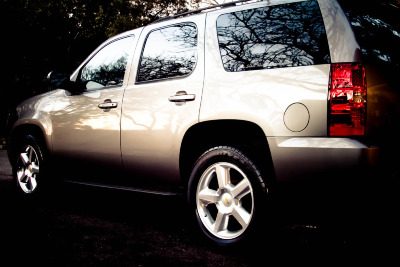
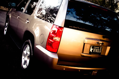
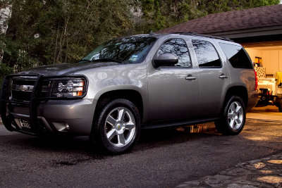
Debadged the day after purchase ........... no matter the color it always looks clean"er" without the badges. Trim obviously came off as well. :)

IMG_2402-3.jpg
IMG_2408-2.jpg
IMG_2404.jpg
 
Last edited:

99fever27

Member
Joined
May 13, 2009
Posts
38
Reaction score
0
I must be the only one that thinks they look better with badges and molding?? They look good either way IMO :Handshake:
 
OP
OP
zach2011

zach2011

Platinum Member
Joined
May 18, 2009
Posts
1,640
Reaction score
4
I like the 2010 look, but Felix if you are going for that you need to align the lettering to the end of the molding. The T should be right above the edge.
 

felixgun

Full Access Member
Joined
Oct 7, 2010
Posts
9,742
Reaction score
125
Location
Lafayette, LA
I like the 2010 look, but Felix if you are going for that you need to align the lettering to the end of the molding. The T should be right above the edge.

Believe me I thought about that and on the 2010 LTZ's the lettering actually starts BEFORE The moulding. It really threw me off. I realize mine is staggered and starts AFTER the moulding, but after carefully examining a 2010 tahoe ltz, it looks like the stock itself is not even lined up (the moulding and words parallel starting with each other). I thought about moving them but I now like my staggered look.

---------- Post added at 05:22 PM ---------- Previous post was at 05:21 PM ----------

I must be the only one that thinks they look better with badges and molding?? They look good either way IMO :Handshake:

Nope i'm right there with you... I hated the side mouldings that came on my 2008 Tahoe LTZ. The ribbed side moulding with the chrome trim (late 08 - 2009) and the 09+ flat moulding with the chrome trim are my two favorite :Handshake:
 
OP
OP
zach2011

zach2011

Platinum Member
Joined
May 18, 2009
Posts
1,640
Reaction score
4
The moldings are great when going for the chrome look. I was gonna order Denali moldings when I first got my Tahoe, but once I saw the 09+ ones I had to get those instead. :D

And that is weird about the lettering. Maybe the one you saw had a factory mistake? My mom's Escalade lettering is aligned right above the molding, edge-to-edge, as well as my dad's Sierra. They are both 2010 models.
 

07Burb

GM fan for life
Staff member
Administrator
Supporting Member
Joined
Jan 3, 2011
Posts
50,322
Reaction score
17,040
Personally, I'm a fan of my body colored side molding. It breaks up the "plain" body lines just enough but yet still blends in so I'm definitely keeping my molding but will get to my "Suburban" on the doors in a couple months :)
 

Forum statistics

Threads
132,087
Posts
1,862,135
Members
96,554
Latest member
eod_tech

Latest posts

Top